While making a website or creating a course for users, we always strive to make it responsive. We ensure that it looks perfect in all devices, and the content on the page comes up clearly.
In GrassBlade xAPI Companion v2.0, we made xAPI content more responsive and fluid. In this new update, your content will show up elegantly in all different devices.
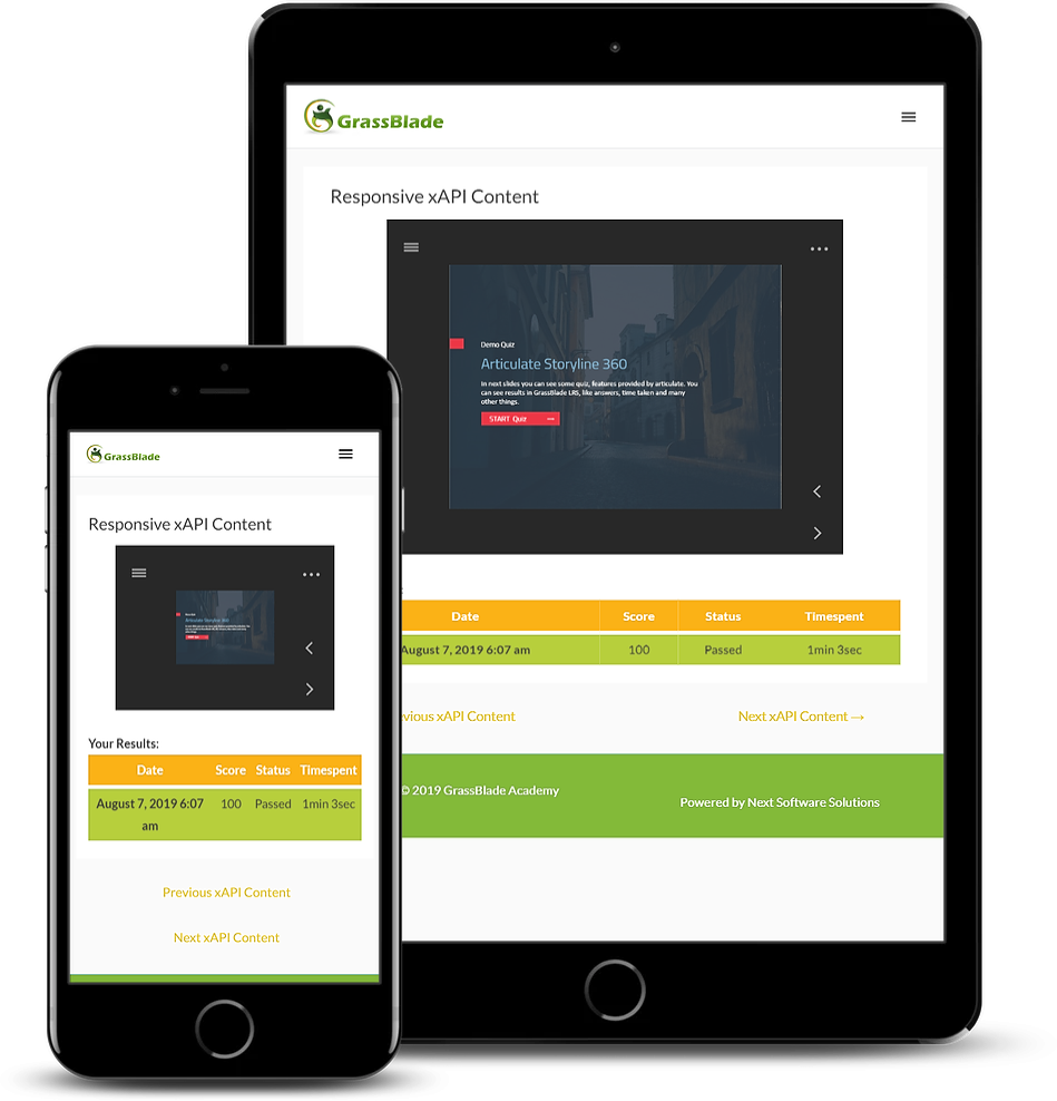
Now, you can set the content aspect ratio with popular preset sizes like in 16:9, 4:3, and 1:1. With this, you can fix the aspect ratio to show content in a fixed ratio in different screen sizes.
Find this setting: xAPI Content edit page > xAPI Content Details > Override Global Settings
If you don’t want to use these presets, you can set it with your desired content aspect ratio. Alternatively, you unlock the aspect ratio to make content more fluid.
In Focus mode, if you don’t see the content in full width. You can change the page width settings from /wp-admin > LearnDash LMS > Settings > General > Focus Mode > Focus Mode Content Width. View Screenshot
How to use?
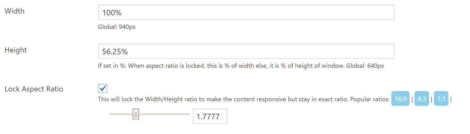
Example 1: Responsive Content – Videos
Videos are responsive and have a fixed aspect ratio, so let’s say you have used YouTube video which has a 16:9 (or 1.7777) aspect ratio. Your settings would be:
- Lock Aspect Ratio: Checked. (clicking 16:9 will automatically set height based on width.)
- Width: 100%
- Height: 56.25%
Based on your UI and preference, you can change the Width/Height in the same ratio.
Example 2: Fluid Content – Articulate Rise 360
Articulate Rise 360 content is fluid and works with any aspect ratio. So, you might want to keep it fluid. Your settings would be:
- Lock Aspect Ratio: Checked. (clicking 1:1 will automatically set height based on width.)
- Width: 100%
- Height: 100%
Based on your UI and preference, you can change the width and height to a smaller value like 90%.
Example 3: Using Viewport size to set the width and height of the content
You can set up the content’s width and height with respect of viewport’s width and height. For that you will have to use ‘vw’ and ‘vh’ at the end of the value. ‘vw’ is used to set the value with respect of view port width and ‘vh’ is used to set the value with respect of viewport’s height.
- Lock Aspect Ratio: Unchecked.
- Width: 100vw
- Height: 100vh
Example 4: Non-Responsive – Articulate Storyline 2
Contents that are fixed size and non-responsive like Articulate Storyline 2 (especially the flash version) do not work well with a responsive container and you would want to have a fixed size setting for them. For example, if you have a content of size 960 x 640px. Your settings would be:
- Lock Aspect Ratio: Unchecked.
- Width: 960px
- Height: 640px
In this mobile world, every other person is using multiple devices. To make the user experience more smooth, we have to provide support for all type of screen sizes.
At Next Software Solution, we also believe in interoperability and smooth user experience. Our team is always ready to make the necessary changes to meet the latest design and technology trends.
Hope you find these features useful. If you have any comments, suggestions, or feature requests feel free to drop a message in the comment section below or contact us.
Follow us on Facebook, Twitter, and LinkedIn for more latest and quick updates.
Hi,
what about previously uploaded content? It became automatically responsive? I have more than 600 uploads.
Hi Konstanty,
For previous content, it will depend on existing settings (for ex: in page will be responsive). You can test new settings on one content, then perform a bulk update from bulk settings.
Regards
Hello,
is it possible to have a toggle for “landscape” reading on a smartphone?
Thank you
sorry, I misspoke: what are the best settings for full screen horizontal reading
Hi Pascal,
it completely depends upon your content, to understand the best fit for your content you can try multiple combination of responsiveness settings.
Regards