You can view the stacked verb chart on the Dashboard, Activity Stream, Verbs, and Learners Report pages. This chart shows which verbs were triggered and how many statements were received for each one within the selected time range.
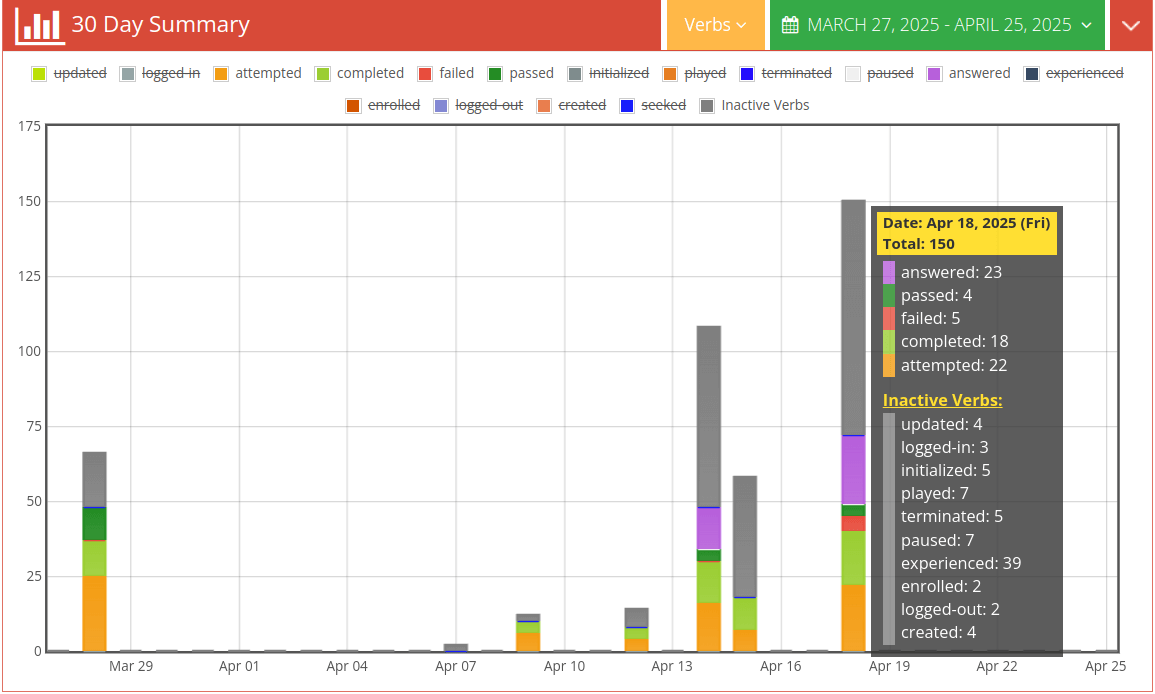
Use the Verbs dropdown at the top to select the specific verbs you want to visualize, and choose the desired date range. Each verb is represented by a unique color, and the chart displays them as stacked bars. The height of each colored segment indicates the number of statements recorded for that verb, helping you compare activity at a glance.
Hover over any bar to see the exact number of statements for each verb on a particular date.